![]()
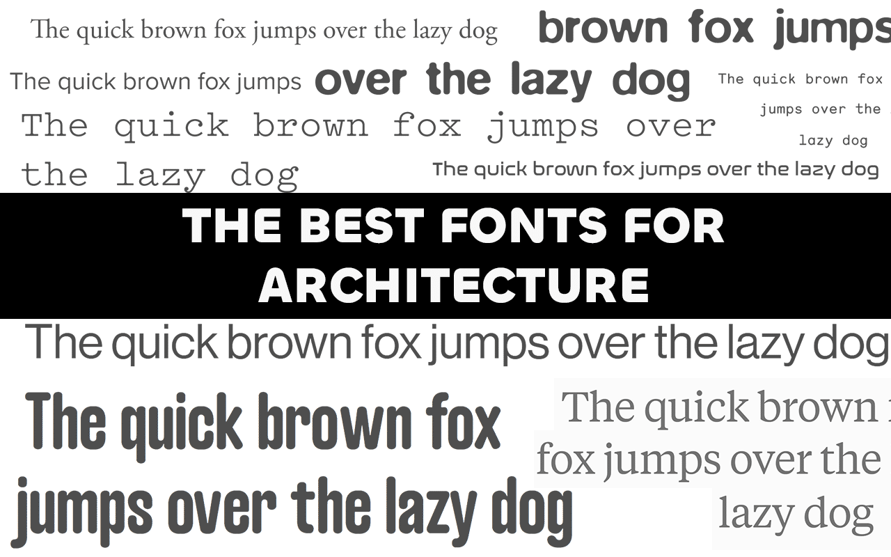
Choosing a font for your architecture project can be daunting; so many cool fonts, so little time. Here I’ve collected some of the most well loved and interesting fonts that work fantastically in architecture portfolios and projects.
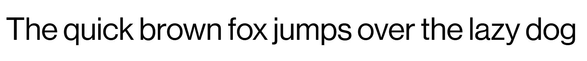
Sans-Serif
Sans-serif are typefaces without the little tails or feet on the characters. They display better on screens making them easier to read, and have a more modern and clean feel. Here’s some of the best:
Futura: Adobe font

Proxima Nova: Adobe font

Neue Haas Grotesk: Paid or Adobe font
Avenir: Paid

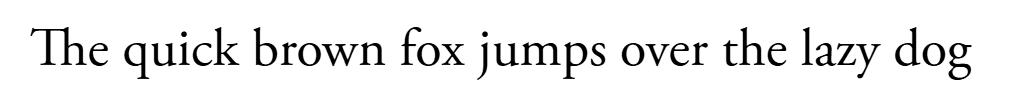
Serif
Serif typefaces are the more traditional looking fonts with tails and feet. They are great if you’re looking to portray authority or history in your work. However, in small or low resolution conditions the characters get a smudgy hard-to-read look meaning Serifs have been reduced to just title work, especially online. Despite this, there are many fantastic serif fonts as you can see below:
Garamond: Adobe font
Tiempos Text: Try for free, commercial license paid

Editorial New: Try for free, comercial license paid

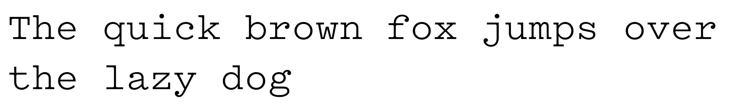
Special fonts
Sometimes you want a signature look to your project, this is where bespoke fonts come in. They’re usually only used for titles as they can be hard to read but they provide a sense of character to your work before anyone’s even read a word.
Typewriter fonts have been very “in vogue” for architecture portfolios in the last 10 years. However, I believe more quirky or digital-age typefaces are going to be popular next.
Courier: Adobe font

Pitch: Try for free, commercial paid license
Monosten: Paid

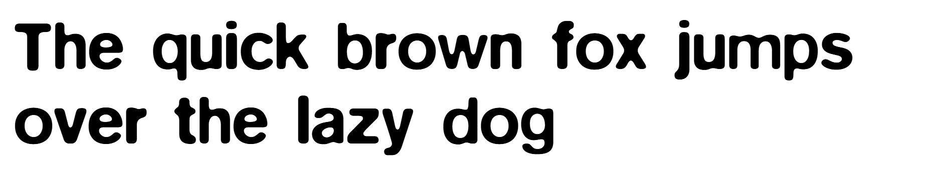
ITC Bauhaus: Paid but many free alternatives available

BlurWeb-Medium W03: Free
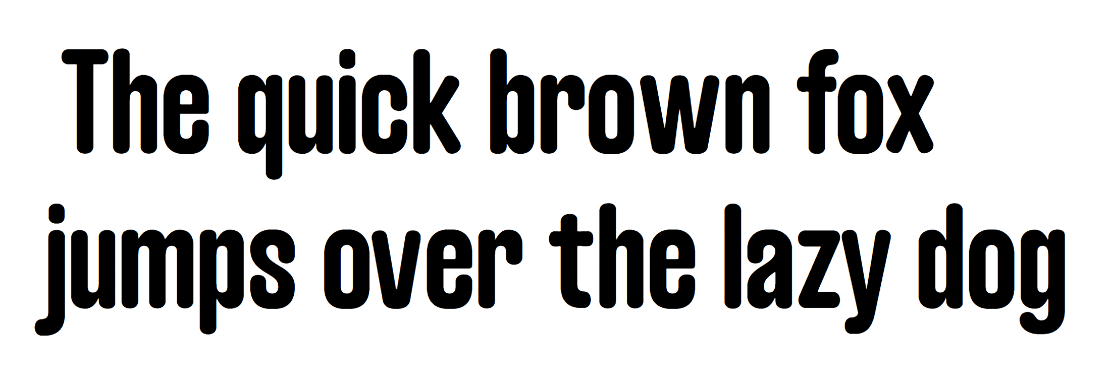
Nasalization: Adobe font

Caramel: Free
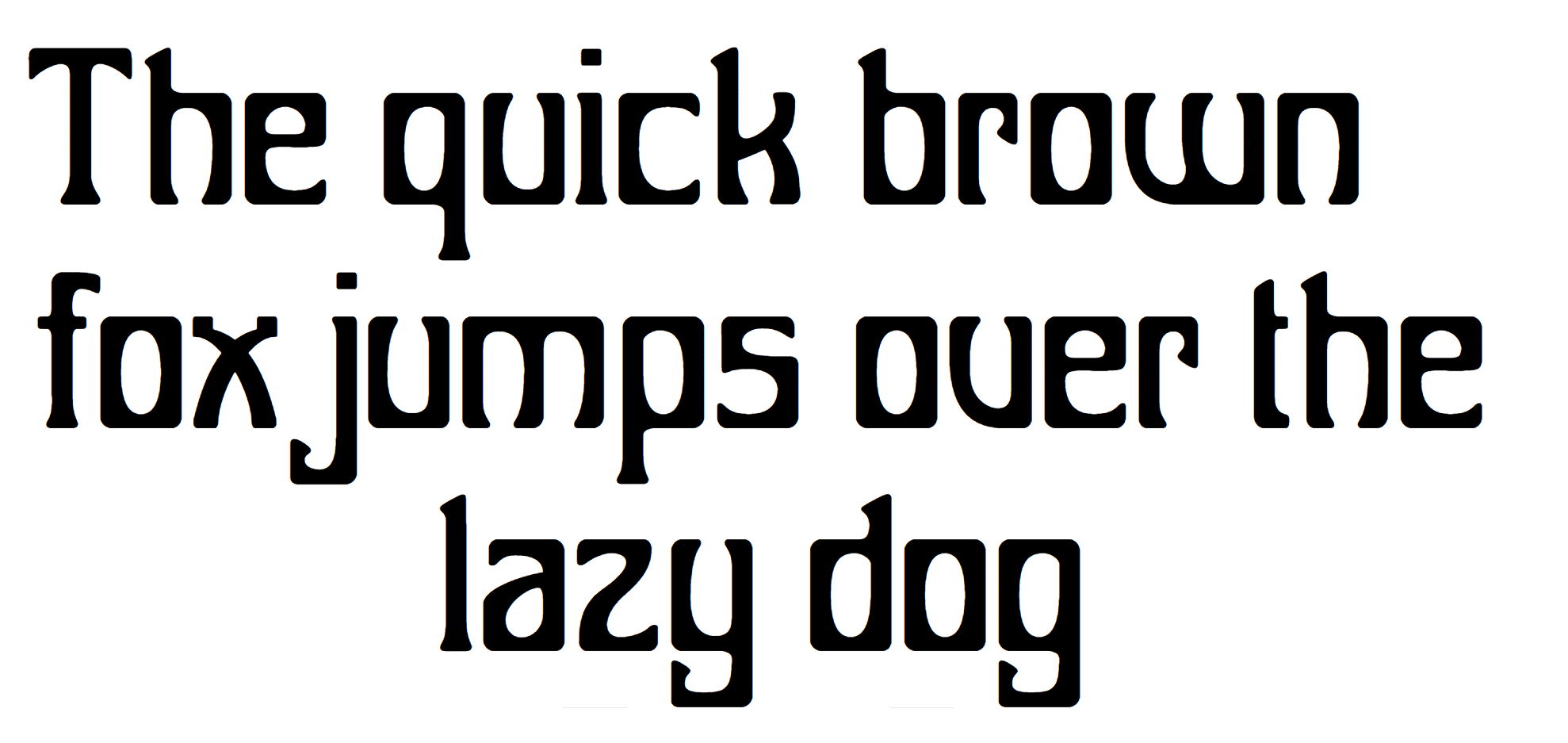
Bocalupo: Free
Doto: Free Google Fonts

Budget font options
While most of these fonts are paid or adobe licensed, there are many free alternatives. The Velvetyne Libre has collated the best reputable free font sites here. Even if you have the budget, I highly recommend looking through these collections as they are full of unique and wonderfully developed fonts.
Thank you for reading!
If you enjoyed this article, head over here for more resources 🙂
Let me know down below if you’re go-to font isn’t on here or if you know any more font foundries